
Adobe - Hva Flow Map
A visual framework to align stakeholders and developers around the customer journey in Adobe’s engagement and retention site.
Context
Adobe’s engagement and retention ecosystem spans multiple applications, devices, and user paths. As High-Value Assets (HVAs) grew in scope, the team lacked a unified view of customer journeys across touchpoints, limiting shared understanding and inhibiting consistent UX decisions.
Outcome
Created a unified journey map that aligned cross-functional teams around complex High-Value Asset flows, becoming a foundation for workflow optimization and decision-making—especially when coordinating changes across apps and devices.
Without a consolidated journey model, stakeholders and developers struggled to diagnose pain points, align on interaction logic, and optimize cross-device experiences — making it difficult to prioritize improvements or streamline workflows.
Problem StatementProject Lead, UX Designer & Flow Map Lead — responsible for framework definition, design decisions, and cross-functional alignment.
RoleCollaborative engagement with Creative Direction, Senior Product Management, and Development leadership
TeamProject Duration~3 months (concept to delivery)
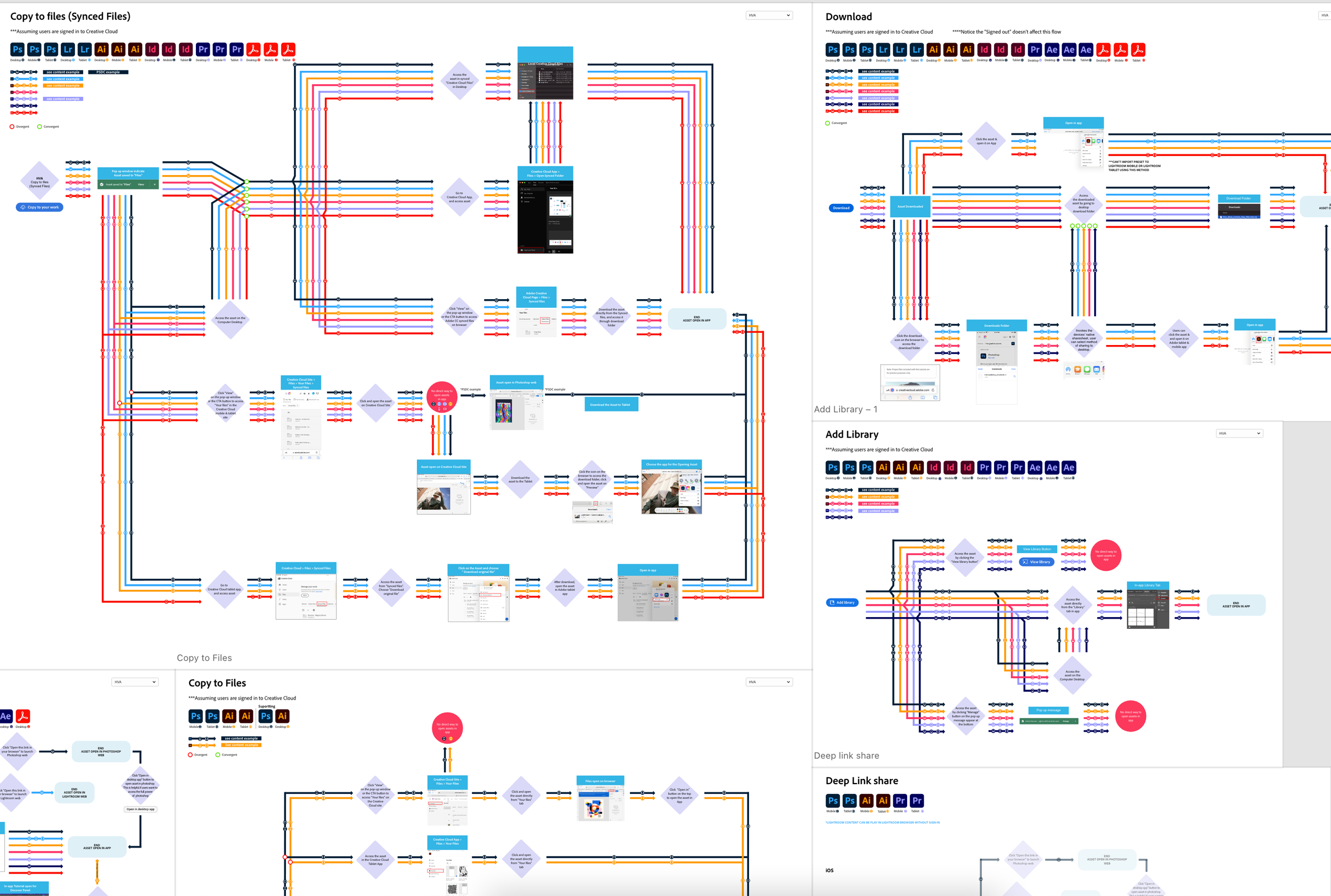
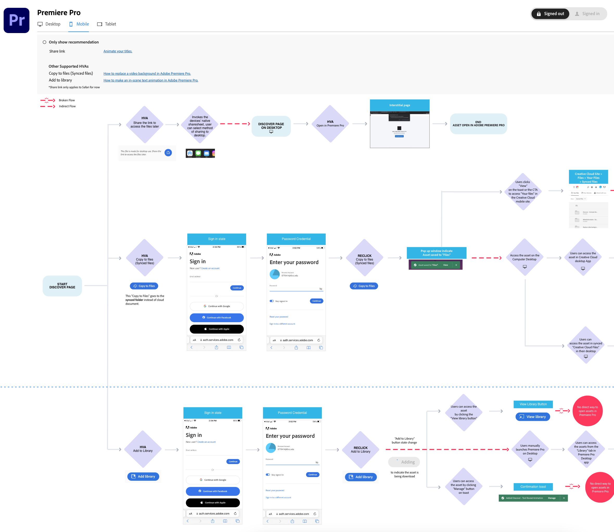
Prototype Map in Action
This prototype visualizes how customers move through tutorials and asset workflows across Adobe Creative Studio apps, accounting for device differences (desktop, mobile, tablet) and authentication states.
By externalizing these paths into a shared, interactive model, the flow map exposed key drop-off points, clarified ownership across teams, and enabled stakeholders to evaluate trade-offs and alternatives in real time—turning abstract conversations into actionable, visual decision-making.
Research
To accurately represent complex customer journeys, I combined behavioral data, multi-device testing, and ongoing stakeholder collaboration to inform and validate the flow mapping work.
Behavioral Tracking: Using Google Analytics and Hotjar, I analyzed end-to-end customer paths to identify drop-off points, abandoned flows, and recurring friction—revealing where users struggled to access or complete tutorial actions.
Multi-Device Simulation: Flows were tested across desktop, mobile, and tablet to surface platform-specific constraints and interaction differences that would not have emerged through single-device analysis.
Stakeholder Engagement: Flow maps were reviewed iteratively with product managers, developers, and creative directors. Ongoing feedback shaped refinements and ensured alignment across customer needs, technical constraints, and business priorities.
Together, these methods produced a comprehensive, validated view of the customer journey, giving teams a shared framework to identify breakpoints, align decisions, and guide future improvements.

Cross-team alignment: Flow map validated with product, development, and creative partners in live reviews.

Design
The flow map was intentionally designed using a subway-map metaphor—inspired by Massimo Vignelli’s New York City transit system—to simplify complex, multi-path journeys into a clear, navigable system.
This approach treated Adobe’s engagement and retention ecosystem as a connected network, allowing teams to see how apps, devices, and actions intersected across a single visual framework.
Color distinguished Adobe applications at a glance, reducing cognitive load when comparing parallel flows.
Icons represented devices (desktop, mobile, tablet), making cross-platform friction immediately visible.
Shapes served as shorthand for actions and states, enabling fast scanning without reliance on lengthy labels.
Together, this design language gave developers and creative directors a fast, intuitive way to trace journeys, identify breakpoints, and align on priorities. Instead of debating abstract descriptions, teams could visually compare flows, converge on pain points, and make confident, shared decisions.


Supporting Flow Maps
Alongside the primary flow map, I created device- and app-specific variations to capture contextual differences and surface friction points that would not appear in a consolidated view (e.g., mobile-only drop-offs, workflow differences between Illustrator and Photoshop).
These supporting maps gave developers and product teams a granular view of where breakdowns occurred, validating that the consolidated model reflected real user behavior across platforms while still enabling deeper investigation when needed.

Moving Forward
The flow maps became a foundation for cross-team alignment after being presented at Adobe’s quarterly all-hands. Product managers, developers, and creative directors now rely on them to visualize complex workflows across apps and identify where improvements will have the greatest impact.
Beyond a single project, the maps established a shared decision-making framework, enabling teams to move faster, align earlier, and reason about trade-offs with clarity across product, design, and engineering.
“Martin’s flow mapping brought clarity to the entire Lightroom in-app experience and created a valuable reference for future photo team initiatives.” - Kendall Plant, Creative Director Manager
“One of the most effective and useful tools our team has used—transforming how we understand and evaluate the end-to-end user workflow.” - Karthikeyan D, Adobe Senior Product Manager
“The flow map made complex journeys immediately understandable. The use of color, icons, and spacing enabled teams to navigate scenarios with confidence.” - Allison McGrath, Associate Creative Director for Creative Cloud at Adobe
Looking ahead, the maps continue to evolve as a living system, adapting to new scenarios such as unsupported apps or outdated operating systems. Ongoing updates ensure they remain a trusted reference—helping Adobe teams refine journeys and deliver more seamless customer experiences over time.