
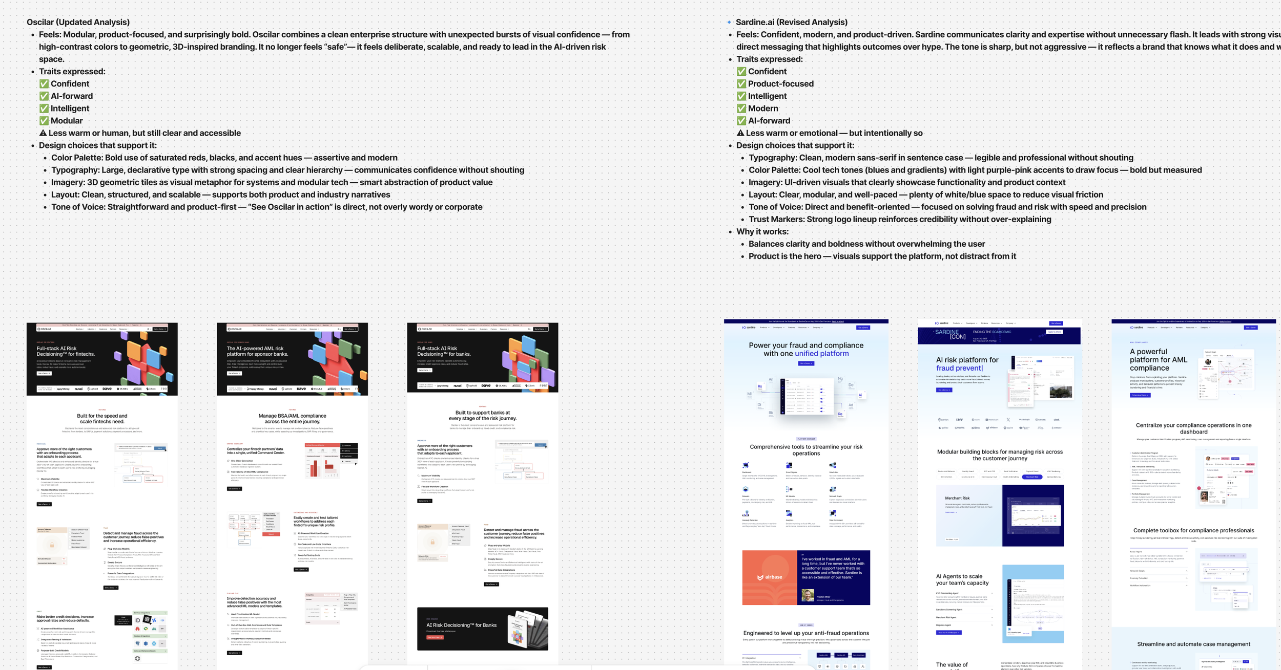
DataVisor - UX Optimization & Web Platform Relaunch
Transforming a complex enterprise AI product narrative into a scalable, performance-minded Webflow experience.
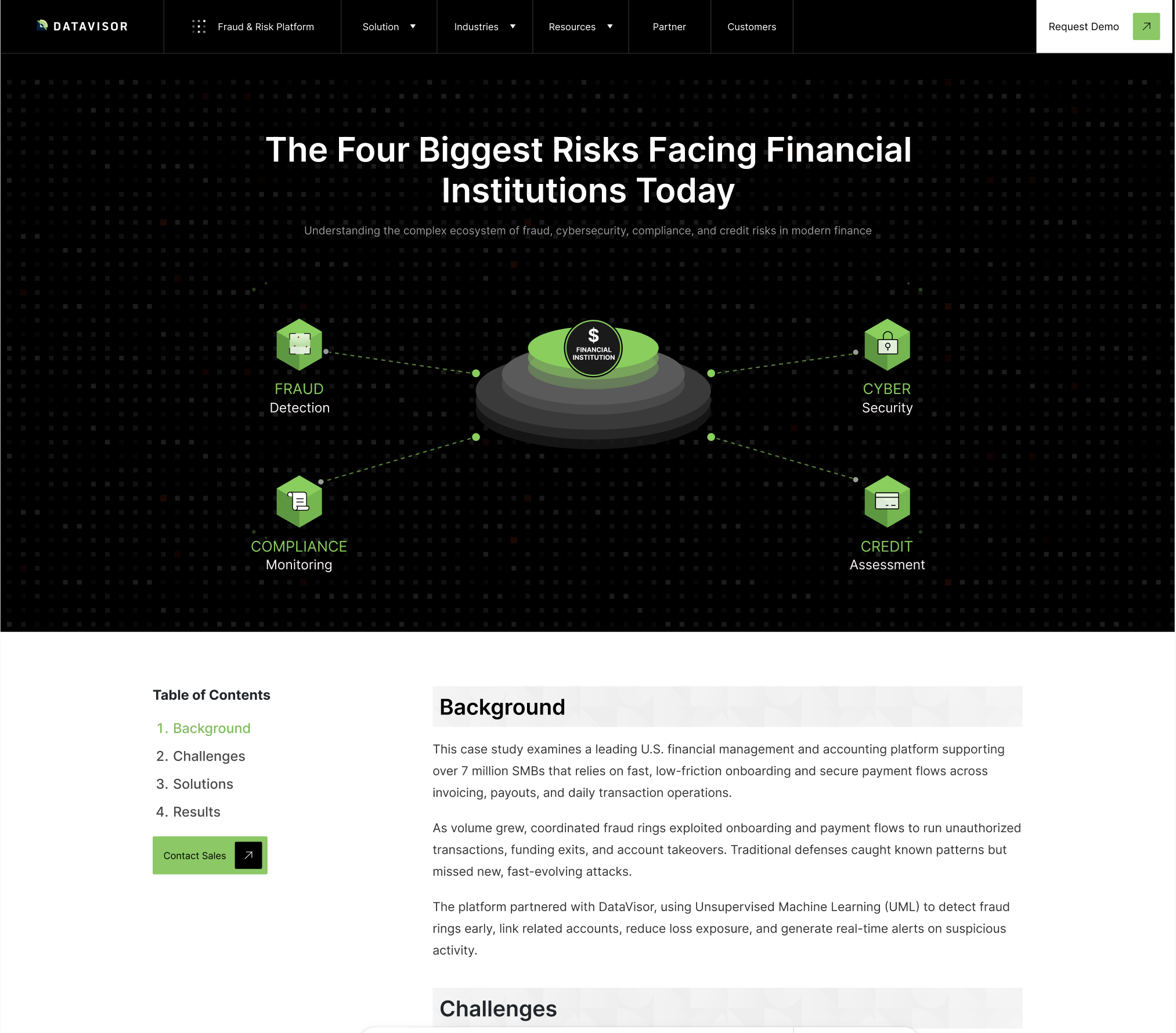
Context
DataVisor is an AI-powered fraud and risk platform used by banks, fintechs, and digital payments companies to detect and prevent financial crime in real time.
The marketing site had grown organically across multiple teams and vendors, resulting in fragmented messaging, inconsistent visual language, and a Webflow implementation that was difficult to scale.
As the company expanded its platform and solutions, it needed a cohesive, system-driven web experience to clearly communicate its product narrative, support platform growth, and establish a scalable foundation for marketing execution across campaigns, content, and SEO.
Outcome
Established a scalable UX and web strategy for datavisor.com, anchored by a component-based design system, clarified information architecture, and a refreshed visual narrative for DataVisor’s AI fraud platform — aligning product, marketing, and engineering teams around a shared system.
Partnered with the CMO, marketing, and Webflow/brand teams to migrate the site from WordPress to a component-driven Webflow build, relaunching a unified experience.
The new system improved the platform → solutions → industries → resources narrative, clarifying complex product relationships and user journeys, and providing reusable templates for faster, more consistent page creation.
This foundation enabled a scalable, consistent digital experience supporting DataVisor’s product growth and evolving platform narrative.
Problem StatementDataVisor’s marketing site had become a patchwork of pages and one-off layouts created over time by different vendors and campaigns. Teams could ship new content, but they lacked a shared model for which stories the site should tell, how prospects should move through them, and what guardrails would keep the experience coherent as the product and brand evolved. As a result, critical platform and solution narratives were diluted, updates were slow and fragile, and every new page risked introducing another inconsistency. The challenge was to redesign datavisor.com as a governed web platform—clarifying the journeys it needs to support and defining the structures, components, and rules that would let marketing move faster without breaking the experience.
RoleI orchestrated the end-to-end digital transformation, serving as the central bridge between internal stakeholders, the branding agency (553DR), and the implementation partner (Shadow Digital). By coordinating workshops and structuring feedback cycles, I aligned fragmented requirements to deliver a unified product vision and design system in a high-pressure 50-day turnaround.
TeamDataVisor: CMO and Marketing Leadership, Product Marketing, Content
Branding Agency: 553DR
Web Platform Partner: Shadow Digital (Webflow implementation)
Project DurationMulti-phase engagement over ~18 months (from initial discovery through Phase 1 launch and ongoing optimization)
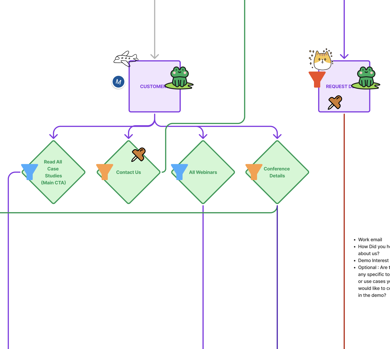
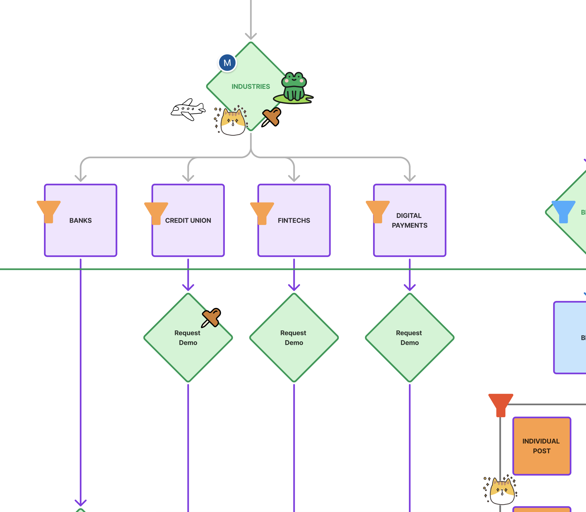
Experience Map:
From Fragmented Pages to a Coherent Journey
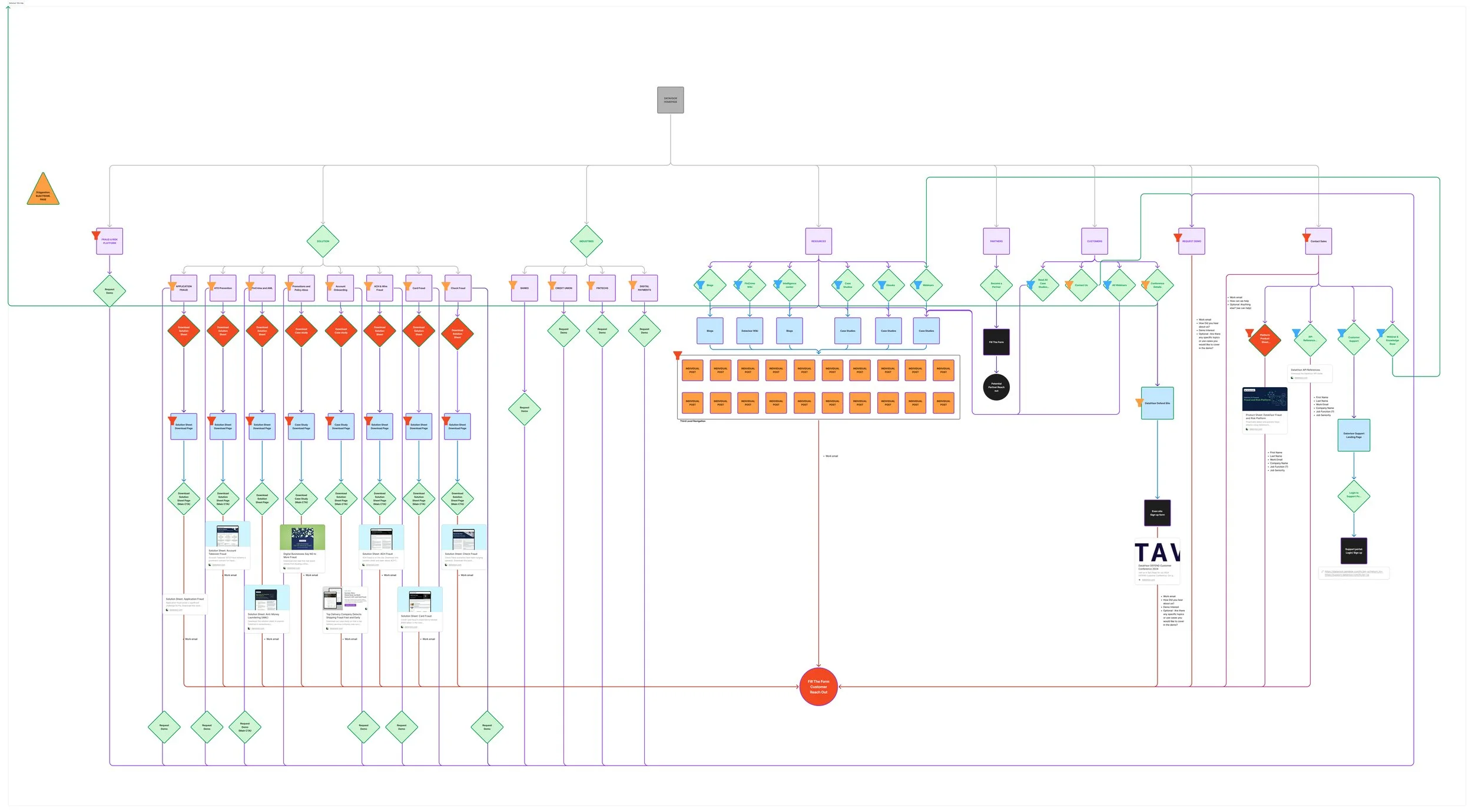
Experience Map & Site Framework
To move beyond page-by-page fixes, I mapped how datavisor.com should guide prospects from first touch through the full AI fraud platform story—spanning platform, solutions, industries, and proof (customers, resources, events). The Figma map consolidates what had been scattered across disconnected pages into a single, shared view of the site as a system, not just a collection of URLs.
On top of the structural map, I layered a review framework to stress-test the architecture:
Funnel stages – Each page was tagged as Awareness, Consideration, or Conversion to check whether content and CTAs matched user intent at that stage.
User segments – Pages were labeled for Package/visual-first users, Premium/Advisor users, or both, to see where journeys diverged or overlapped.
Redundancy & utility – Pages with overlapping topics or duplicate CTAs were flagged, and key resources were scored on usefulness to prioritize consolidation, redirects, or redesign.
Scalability & future-fit – The map was evaluated against future needs (new products, packages, and personas) to ensure the structure could grow without breaking.
This combination of system map + evaluation criteria became the backbone for collaboration with the CMO, marketing, 553DR, and the Webflow team—giving everyone a concrete, shared model for how the site should work end-to-end and where to focus next.
Discovery & Alignment Workshops
To avoid jumping straight into visuals, we ran a series of three structured working sessions to align on what datavisor.com needs to do, which pages matter most, and how the brand should show up across the web experience.
Session 1 – High-Impact Pages & Site Priorities
We started by identifying the highest-engagement pages and defining what each needed to become in the new system: Platform, Solutions, Industries, Contact/Demo, and Homepage.
Key outcomes:
Platform – Reframe as a comprehensive navigation hub that clearly explains “What is the Platform?” across data orchestration, real-time detection (including GenAI), case management, and analytics, with strong benefit framing and links into solutions and industries.
Solutions – Modular, outcome-driven pages for each use case (e.g., onboarding, AML, transaction monitoring) with deep dives, stats, trust proof, and relevant resources.
Industries – High-intent, funnel-focused pages with a Problem → Journey → Solution → Result narrative and tightly scoped CTAs.
Contact / Demo – Conversion-optimized forms with clear expectations, brand-aligned microcopy, and frictionless layouts.
Homepage – Quickly reassert DataVisor’s authority with a focused hero, platform/solution/industry previews, social proof, and clear paths to Request Demo / Contact Sales.
This session defined where Phase 1 would focus and which pages would anchor the new architecture.
Cross-team alignment: Journey maps reviewed with product, marketing, and design partners to agree on priority pages, owner responsibilities, and the “happy path” through the new site.
Session 2 – Competitor Benchmarking & Structural Patterns
Strategic takeaways:
Navigation & structure – Simplified top nav with Platform / Solutions / Industries and a persistent “Request Demo” call-to-action.
Conversion flows – Stand-alone, nav-free demo and contact pages with focused, trust-building copy and clear response expectations.
Content flow – Use a consistent Problem → Journey → Solution → Outcome model for Platform and Industry pages.
Visual & motion rhythm – Light, purposeful animation, section transitions (e.g., dark → light), and branded shapes as long-term goals for Phase 2+.
These insights fed directly into the Phase 1 page models for Platform, Solutions, Industries, Contact/Demo, and Homepage.
Competitive audit of adjacent B2B fintech sites, used to identify reusable patterns for navigation, layout, and conversion sections.
Session 3 – Brand Traits & Unified Design Direction
Finally, we aligned on three core brand traits to guide the web experience: Innovative, Trustworthy, Powerful.
From those traits, we defined a unified visual and interaction system:
Innovative – Data-driven fluid visuals, motion that feels like the system “thinking,” and modular components that adapt across use cases.
Trustworthy – Calm, spacious layouts; UI-first storytelling over stock lifestyle imagery; clarity and honesty in both visuals and tone.
Powerful – Enterprise-grade but approachable; modular, scalable components; interactions that reinforce control rather than complexity.
We translated this into guidance for visual language, layout, motion, imagery, color, and tone so that brand, marketing, and Webflow implementation all drew from the same north star.
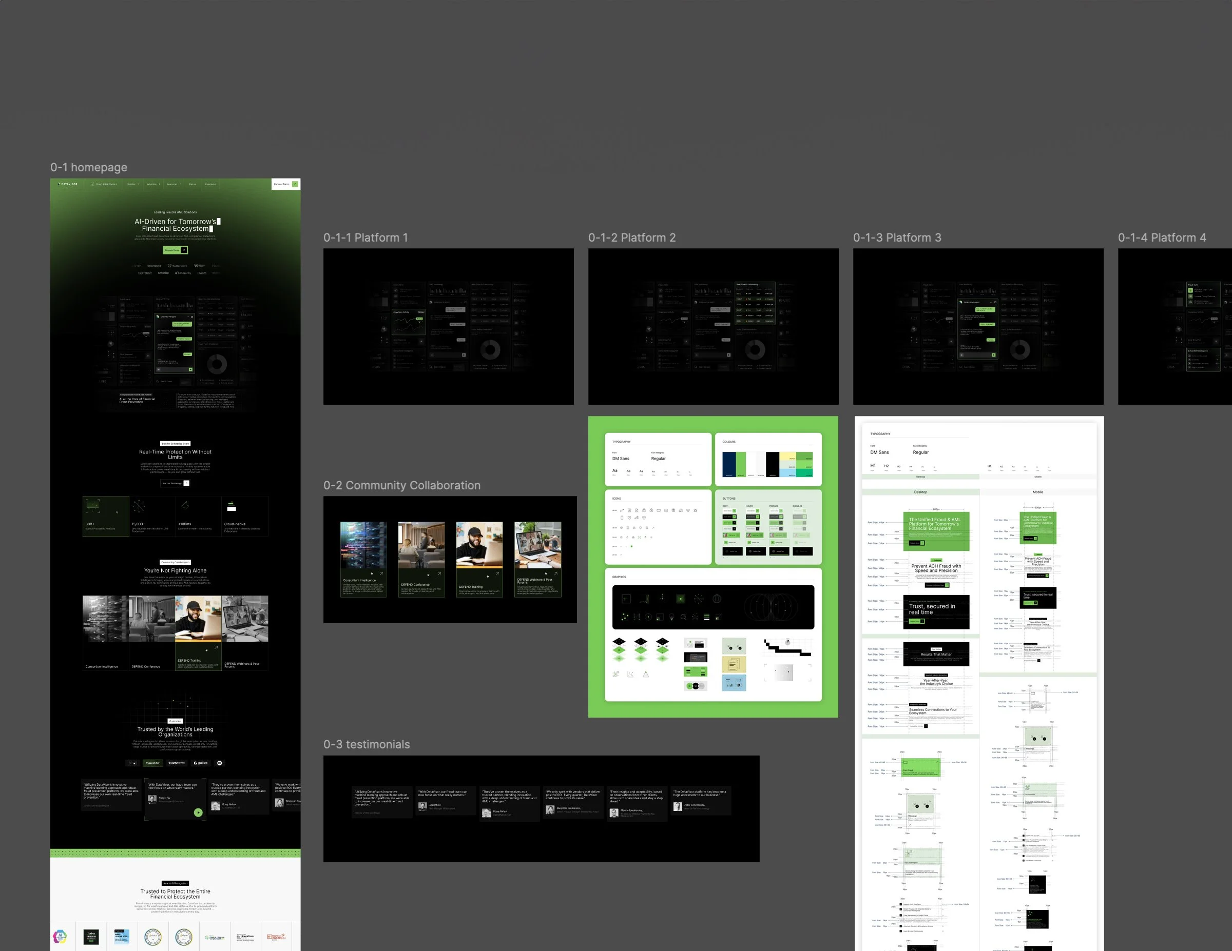
Visual System & UI Kit
With the page models and journeys aligned, the next step was to define a visual system that could scale across the new Webflow build.
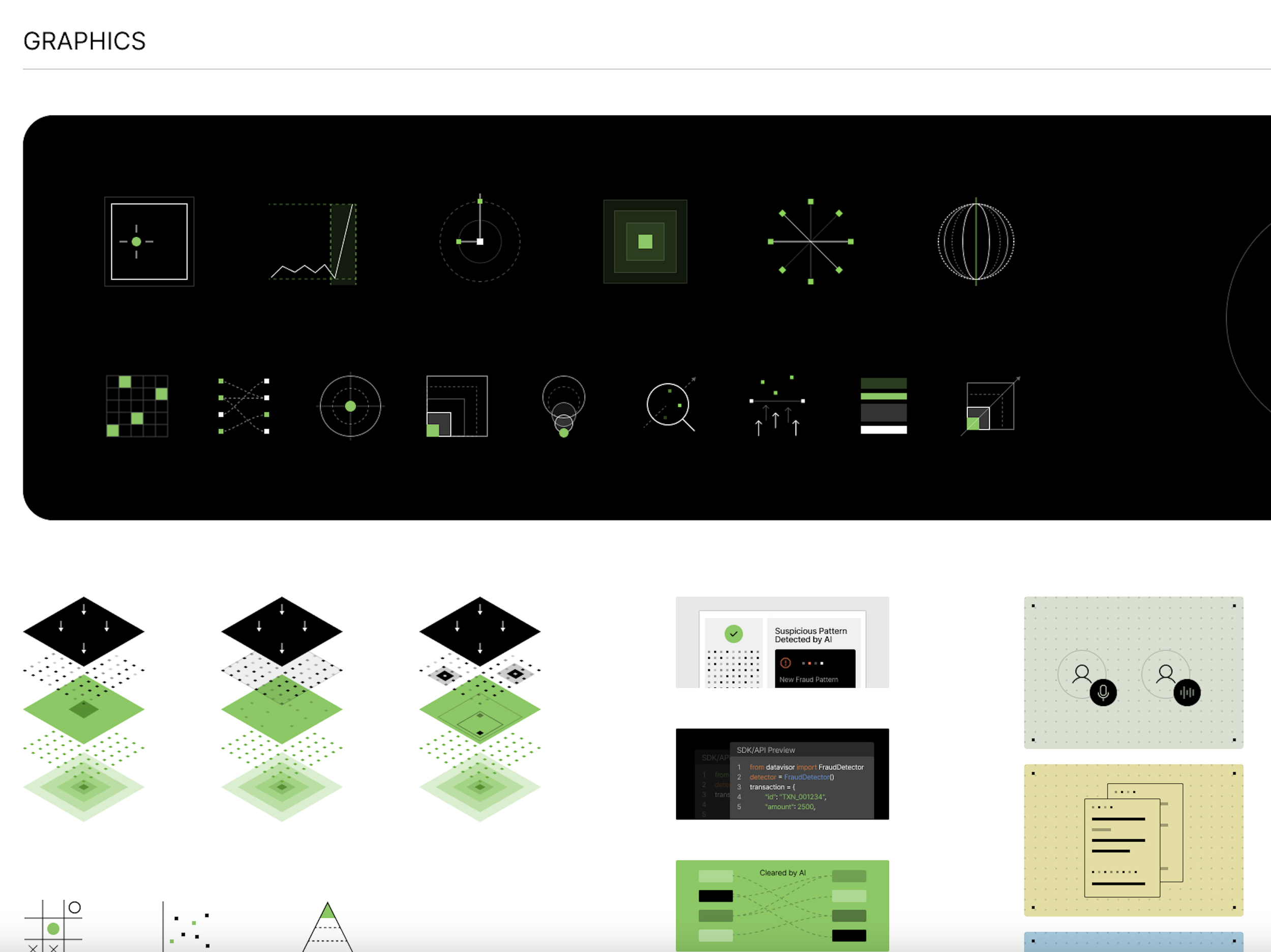
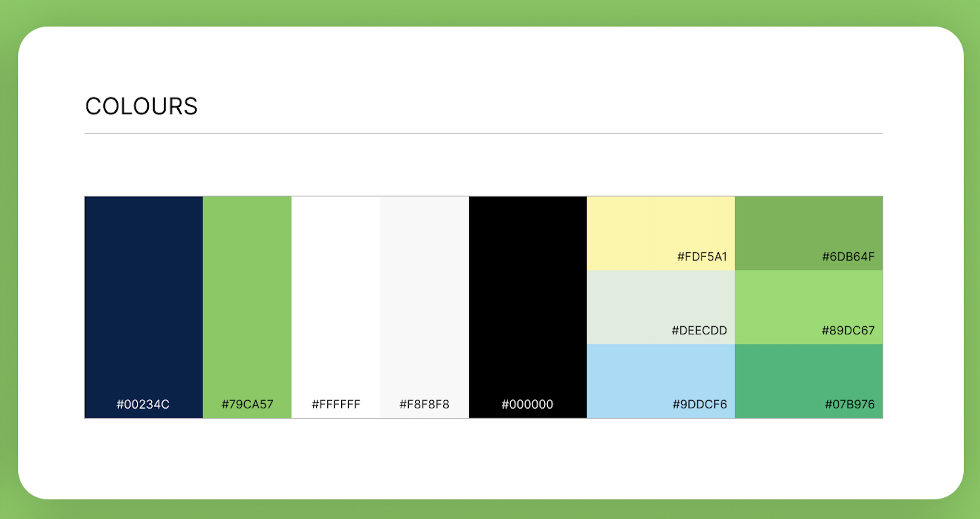
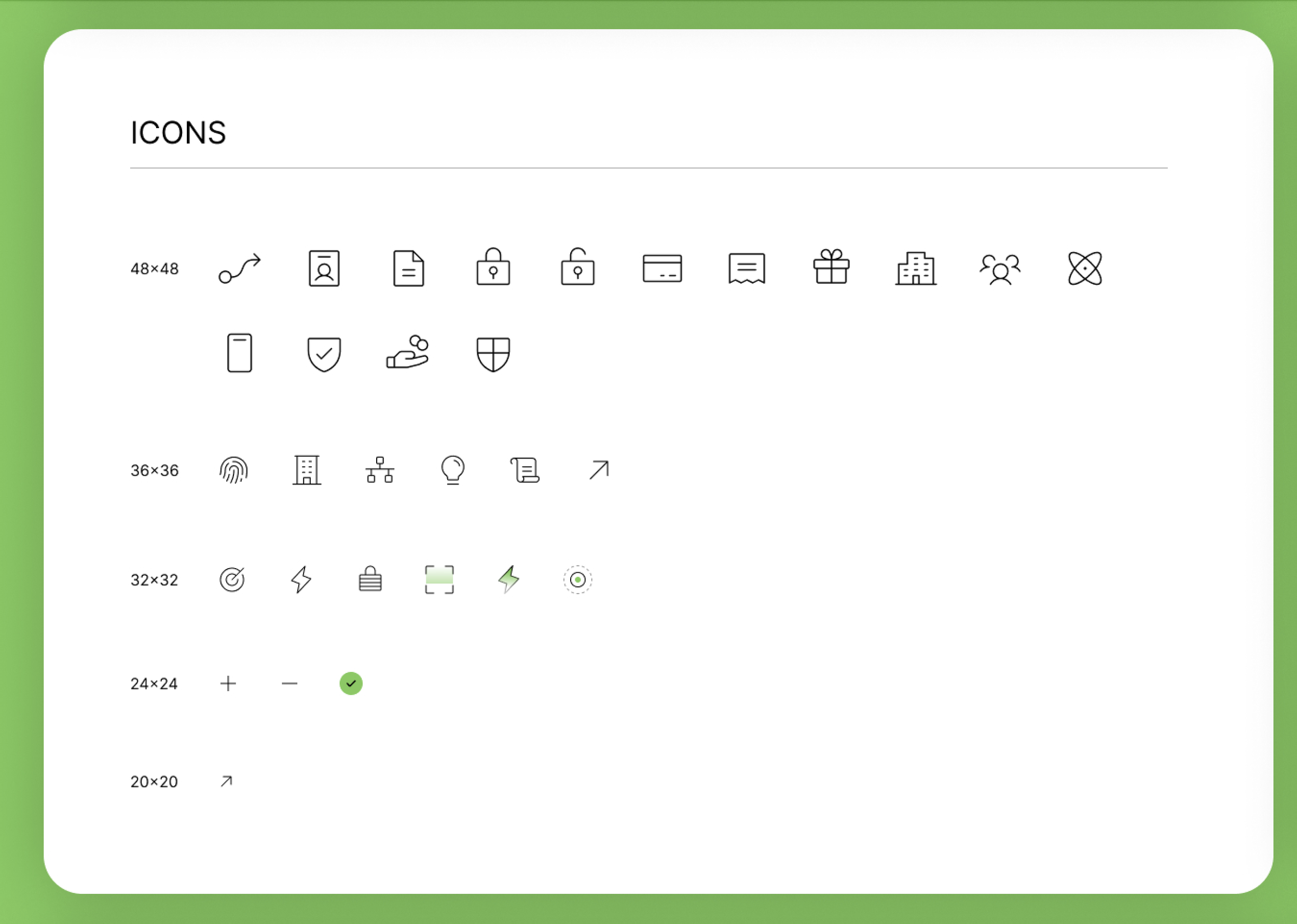
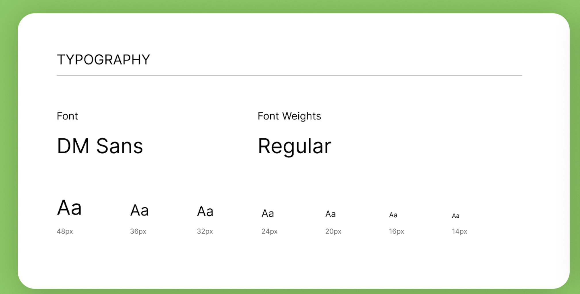
I partnered with 553DR to translate the refreshed brand into a practical UI kit—covering typography, color tokens, button states, iconography, and data-driven graphics. We aligned early on DM Sans as the core typeface, a tiered green/blue palette mapped to key product stories, and a motion-friendly card/grid structure that would work across homepage, platform, solutions, and resources.
The UI kit became the source of truth for both the branding agency and the Webflow team: a component-ready library that reduced one-off decisions and made it easier to roll out new pages while keeping accessibility, contrast, and spacing consistent.
-
![]()
Modular graphics and data visualization elements that support data-centric storytelling, reinforcing the brand’s tech and analytics persona.
-
![]()
Scalable color palette with primary, neutral, and accent colors keyed to mood, contrast, and visual rhythm across the site.
-
![]()
Purpose-built icon set with multiple sizes and states, ensuring visual clarity and consistency for different contexts and densities.
-
![]()
Standardized button patterns and interactive states (rest, hover, pressed, disabled) to support consistent UI behavior and accessibility.
-
![]()
Core typography system using DM Sans with defined scales and weights for hierarchy across headings, body, and UI text.

MVP Model
To kick off the build, 553DR translated early UX alignment and stakeholder insights into the first iteration of our MVP page models, establishing core page archetypes (Platform, Solutions, Industries, Resources, Conversion) and a clear visual baseline for content hierarchy and interaction.
We then ran two review cycles with stakeholders — including the CMO, marketing leadership, and product teams — to refine these layouts. In each cycle, I:
contextualized the page models against the experience map and site framework,
consolidated cross-functional feedback into clear design direction, and
collaborated hands-on with 553DR to revise and re-present for alignment.
This iterative review process ensured narrative flow, content priorities, and conversion intent were agreed upon before we moved into component definition & build.
Reusable Components
Once the MVP page models were finalized, we translated them into a reusable component system — the foundation of the Webflow build. These components were designed to support scalability, consistency, and flexibility across varying page contexts (homepage, platform, solutions, industries, resources) and device breakpoints.
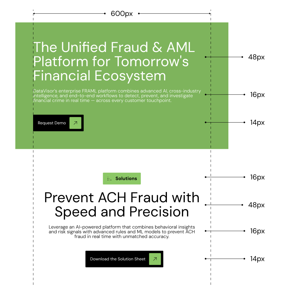
Responsive typography scales & hierarchy: defined type sizes, weights, and spacing tokens for consistent textual rhythm across desktop and mobile breakpoints.
Component rules: low-level tokens (padding, corner radius, control sizes) that ensure components behave predictably and scale with content.
Typography & Layout Specs
Applied context: how typography and spacing adapt across breakpoints for real content layouts.
Module patterns: layout specifications for common elements (cards, hero sections, stats blocks, CTAs), ensuring consistency and predictability across pages.
Module Specs
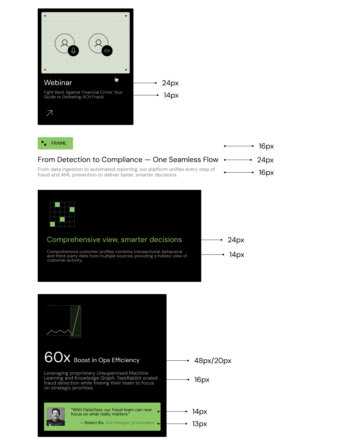
Grid & spacing tokens: standardized spacing, margin, and padding rules to maintain visual rhythm and structure.
Icon sizing & system: a cohesive icon set with clear sizing rules to reinforce clarity and scale across device widths.
Spacing, Grid & Icon Tokens
From Design System to Scalable Site Build
After finalizing the MVP page models and establishing the reusable component system with 553DR, the internal design team took ownership of expanding the site across additional page types and scenarios.
Using the component system as a foundation, we:
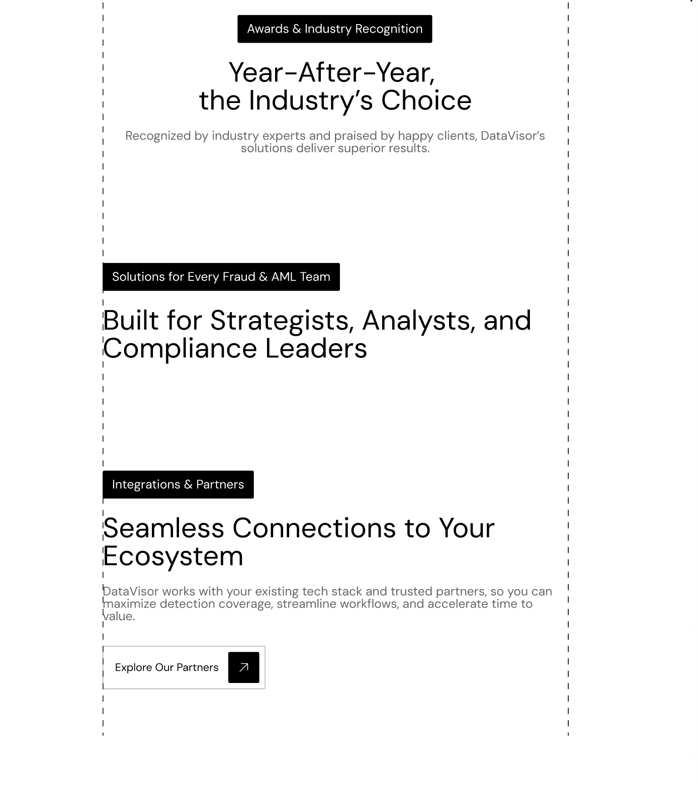
Assembled site templates for all major page families — including Homepage, Platform, Solutions, Industries, and Resources — ensuring a consistent hierarchy and pattern language across the entire site.
Refined component behavior across light and dark modes, breakpoints, and content variations to ensure visual harmony and functional consistency on every device.
Implemented global design rules (type, spacing, tokens) so that even custom content pages could be created rapidly without breaking the system.
This phase transitioned the work from MVP models into a full, scalable site architecture that marketing and product teams can confidently own and extend.
Link to the Live Site
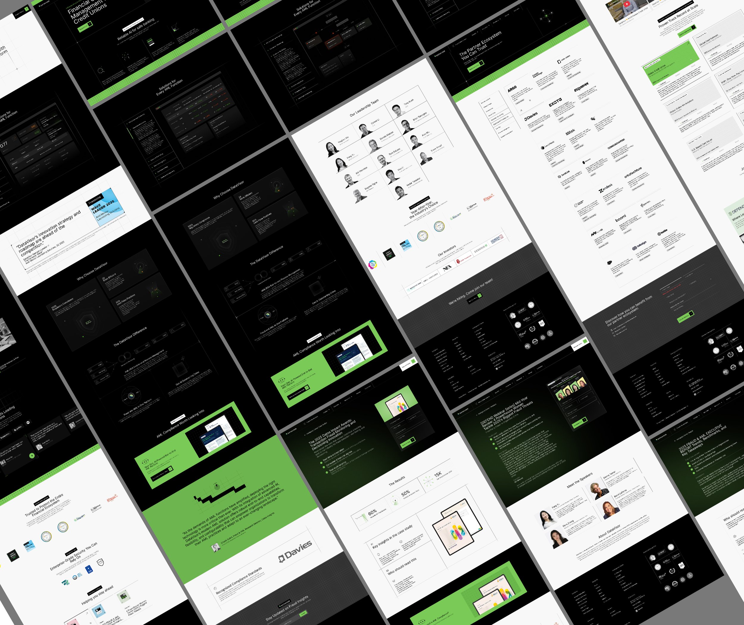
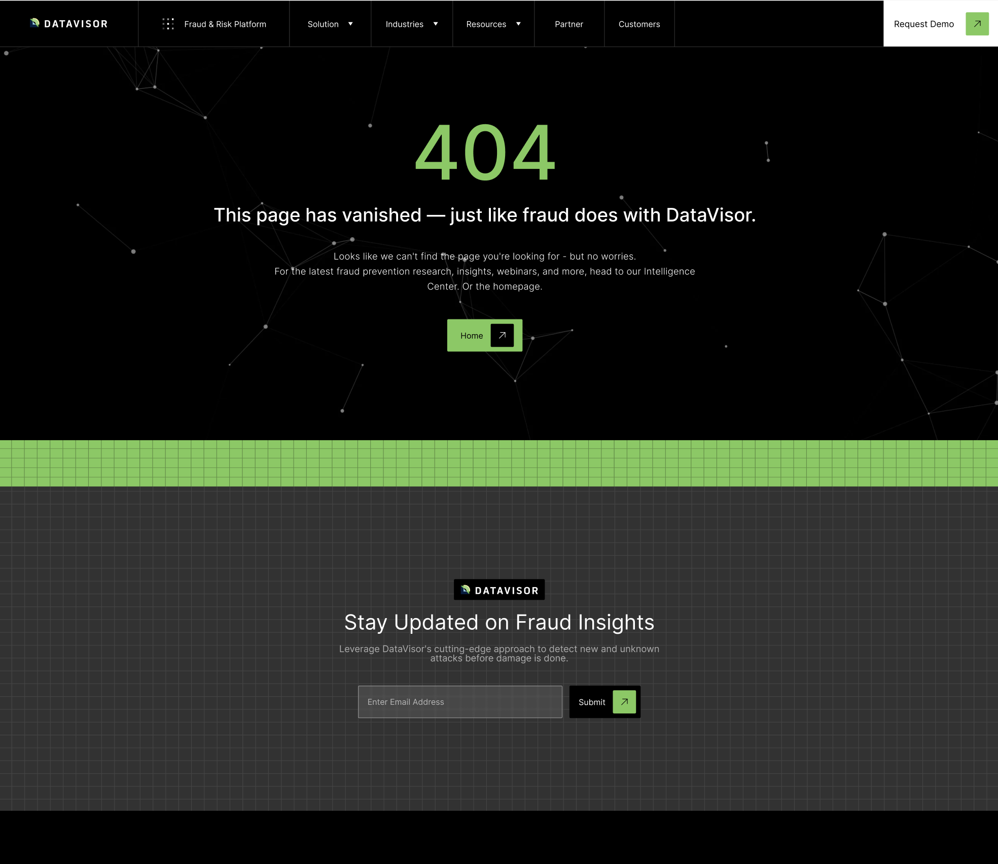
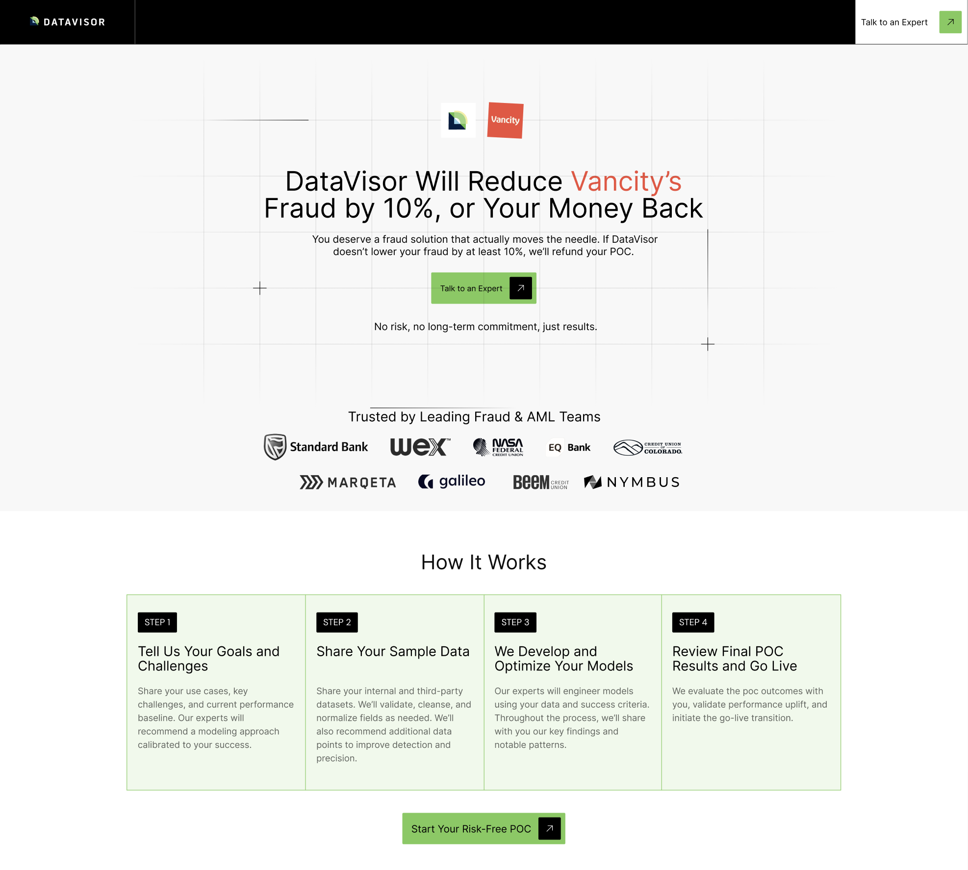
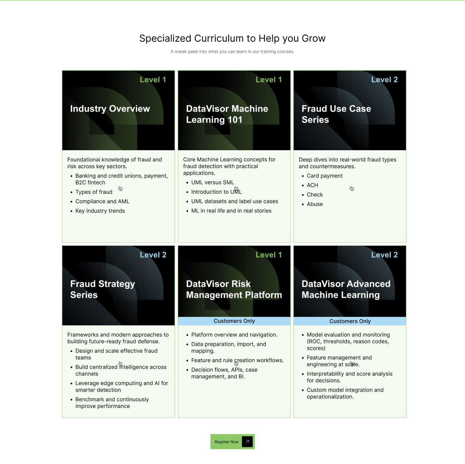
Once the full suite of page templates and components was stabilized and tested, the updated site was deployed using Webflow.
This live rollout reflects a coherent narrative from platform positioning to solution story, industry relevance, resources, and conversion points — all powered by a system designed for scalability.
Early Traction & Feedback
“Early indicators show healthy engagement trends — including elevated visit depth and repeat exploration of Platform and Solution pages — and the team has received positive client feedback on the improved clarity and structure.”
— Alex Niu, Head of Marketing, DataVisor
Since the relaunch, internal teams have observed directional improvements in user behavior and stronger qualitative responses from prospects. Team members have noted that the new experience not only feels more cohesive and easier to navigate, but also communicates DataVisor’s positioning more clearly through a consistent narrative and visual language. These early signals suggest that the combined improvements to structure, system, and visual clarity are resonating with both new visitors and returning users.
This reflects balanced impact: strategic clarity and navigation improvements drove engagement momentum, while reinforcing brand recognition and perceived trust without relying solely on visual style.
While full analytics access isn’t available for this portfolio, these directional engagement trends and positive feedback loops align with the strategic goals of scalability, clarity, and a stronger digital experience. Formal analytics tracking is planned for upcoming phases to measure impact on engagement, conversions, and content discovery metrics.