
Careismatic - UX Strategy & Multi-Brand Component Architecture
Defining a shared UX framework and reusable architecture that preserves brand distinctiveness while delivering consistency, efficiency, and clarity across multiple Careismatic sites.
Experience the System in Production
Brands Powered by the SystemContext
Careismatic was undergoing a strategic shift toward direct-to-consumer growth, with e-commerce identified as a key driver of future revenue.
At the time, DTC represented ~16% of total sales, while the medical apparel e-commerce market was growing at over 15% annually — creating urgency to scale digital infrastructure and improve cross-brand consistency. This unification was critical to support the business's aggressive DTC (Direct-to-Consumer) growth strategy across its $32M multi-brand digital ecosystem.
Outcome
The shared UX framework and reusable architecture gave Careismatic a scalable, portfolio-wide design foundation that reduced design and development overhead while maintaining brand distinctiveness. By codifying shared patterns and component behavior, teams can now build new pages faster with consistent UX expectations and clearer cross-brand experiences. Early internal feedback highlights improved execution velocity, reduced QA friction, and stronger alignment of brand expression across the five properties.
Problem StatementThe lack of a shared UX and CSS foundation led to fragmented decision-making across brands, slowing development, increasing QA friction, and making consistency difficult to maintain at scale.
With DTC at ~16% of total sales and the category growing 15%+ annually, a scalable multi-brand system became critical to supporting future growth.
RoleLead UX & Design Strategist — Led UX strategy and created the shared multi-brand design system adopted across Careismatic’s five e-commerce brands. Worked alongside Product leadership to align requirements while owning system vision, design definition, and implementation direction.
TeamProduct Director — Provided strategic alignment, design review, and co-presentation of key artefacts with stakeholders.
Front-End Engineers — Collaborated on implementation feasibility and responsive behaviour of shared components.
Brand & Product Stakeholders — Validated requirements and priorities across the multi-brand portfolio.
Project Duration4-month engagement — from initial audit through delivery of the shared CSS foundation, components, and early system extensions.
The broader platform initiative continued for 12+ months as the system expanded across brands and additional components.
Discovery & Foundation
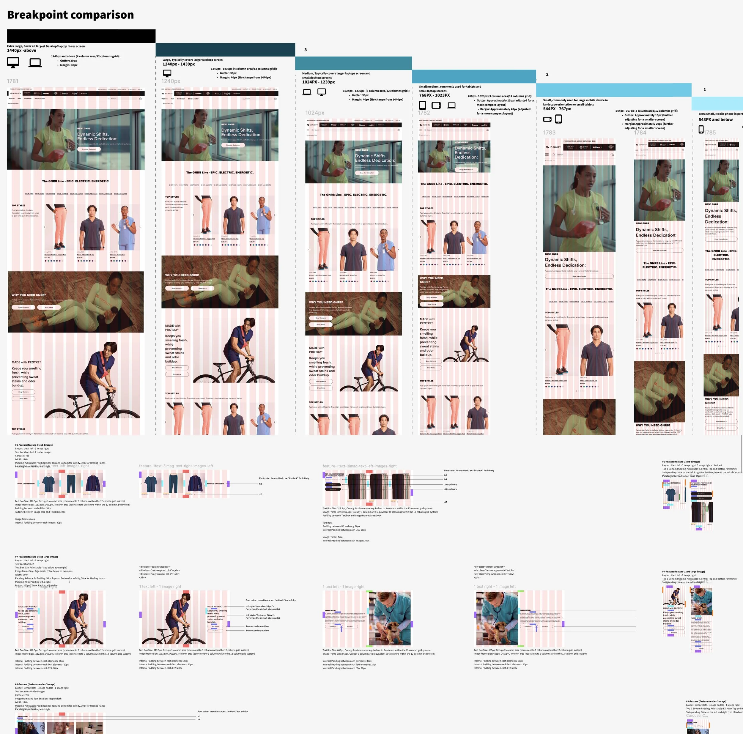
The initial discovery phase focused on establishing a shared understanding of where the portfolio’s design inconsistencies had the greatest impact on UX and engineering velocity. A comprehensive audit of existing styles, breakpoints, spacing rules, component behaviour, and brand exceptions revealed duplicated CSS definitions and divergent UI patterns across the five Careismatic sites.
This informed the creation of a unified CSS foundation and responsive strategy, which became the baseline for all subsequent components and interaction patterns.
Audit of CSS and UI patterns across Careismatic brands to identify shared rules and variance boundaries.
From Brand Requirements to Experience Architecture
With the CSS foundation defined, the next challenge was operational: translating brand intent and market patterns into scalable experience architecture.
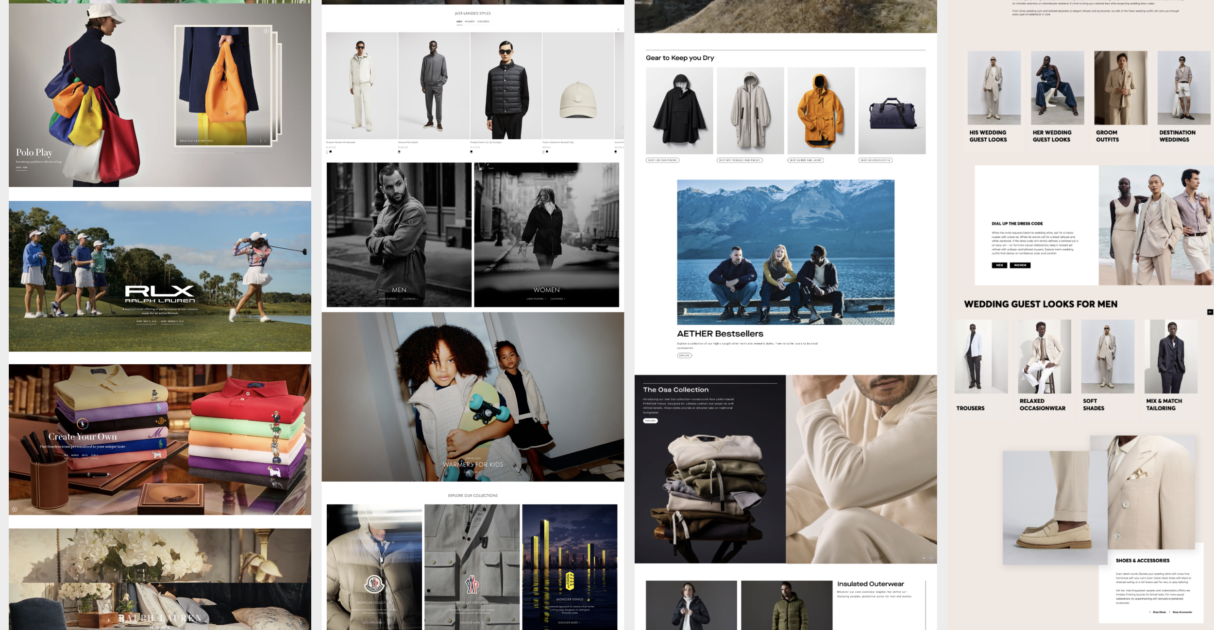
Competitive Pattern Analysis
In parallel, we examined leading apparel and e-commerce platforms to understand how high-performing brands structured:
Homepage narrative hierarchy
Landing page storytelling modules
Product listing page (PLP) layouts
Product detail page (PDP) information architecture
The goal was not imitation, but pattern recognition — identifying scalable layout structures and conversion frameworks that could inform our MVP model.
This dual lens — internal brand clarity and external market benchmarking — informed the first single-page MVP model and initial component system.
Brand Requirements
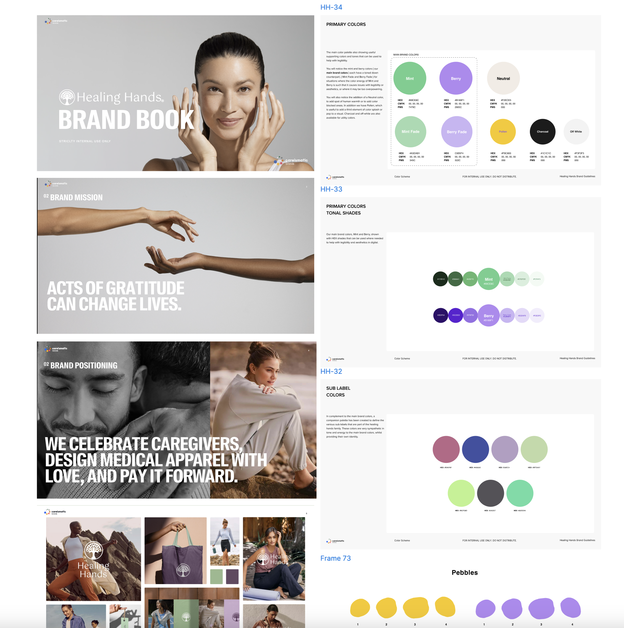
Partnering with brand leadership, we used a structured brand book developed by Creative Director as a foundational input for the Healing Hands prototype MVP.
This document clarified:
Core positioning and messaging principles
Primary and tonal color systems
Visual direction and brand guardrails
Rather than treating the brand book as static guidelines, we translated these requirements into practical layout behaviors and component logic.
Translating Strategy Into a Functional Prototype
To prevent incremental redesign and technical debt, I led a Blue Sky MVP initiative to validate foundational layout and component assumptions before formalizing the design system.
Rather than focusing on visual polish, this phase centered on architecture:
Modular layout experimentation
Grid and breakpoint logic
Content prioritization strategy
Component repeatability modeling
Cross-brand adaptability testing
This prototype became the structural backbone for the scalable Multi-Brand Design System that followed.
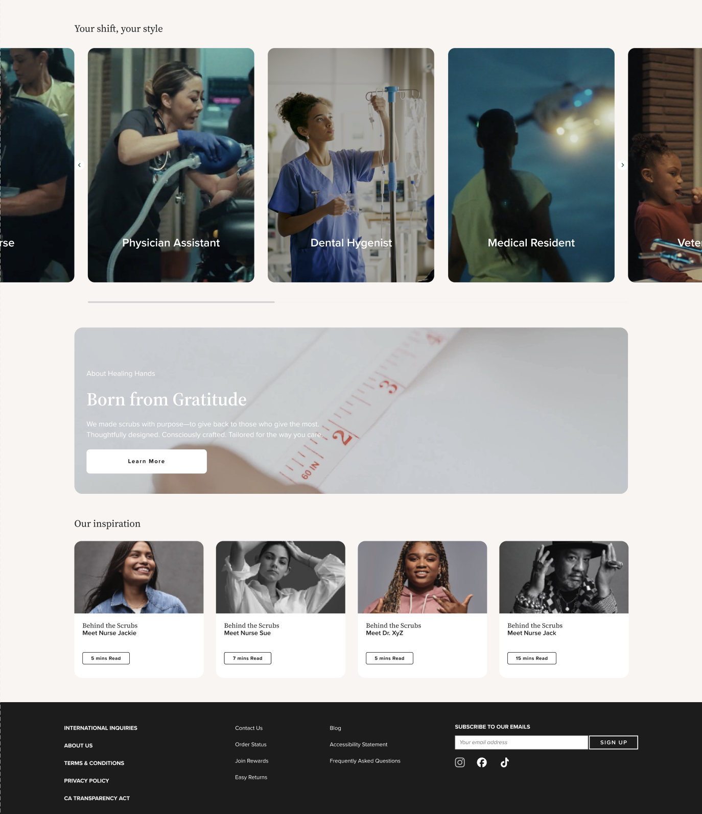
The occupational portal leverages role-specific storytelling components, fostering deeper engagement and aligning brand narrative with user identity.
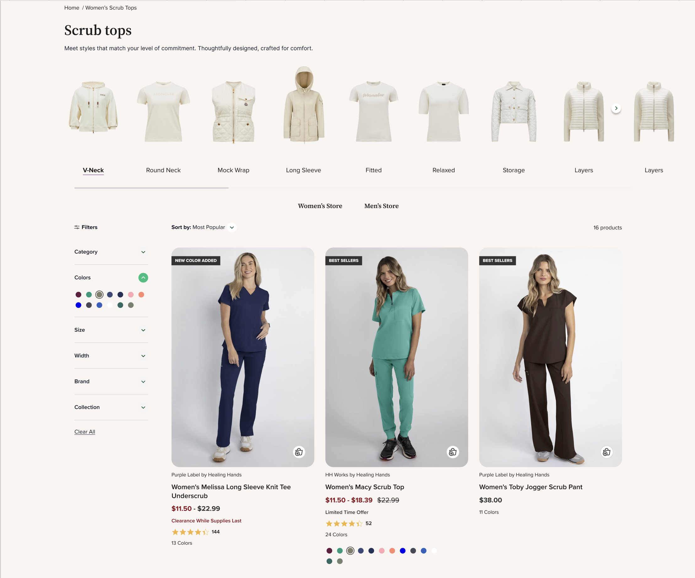
Lay-flat imagery and open filtering simplify navigation, ensuring the focus remains on product clarity.
Attribute-based filtering not only aids discovery but reinforces branded product benefits like easy care or durability.
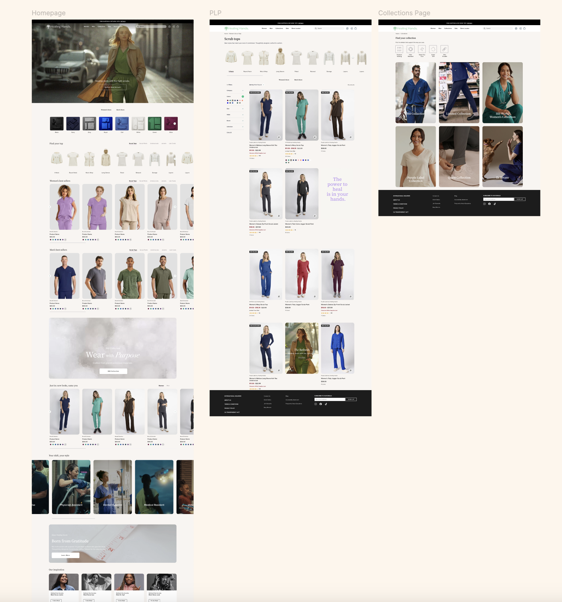
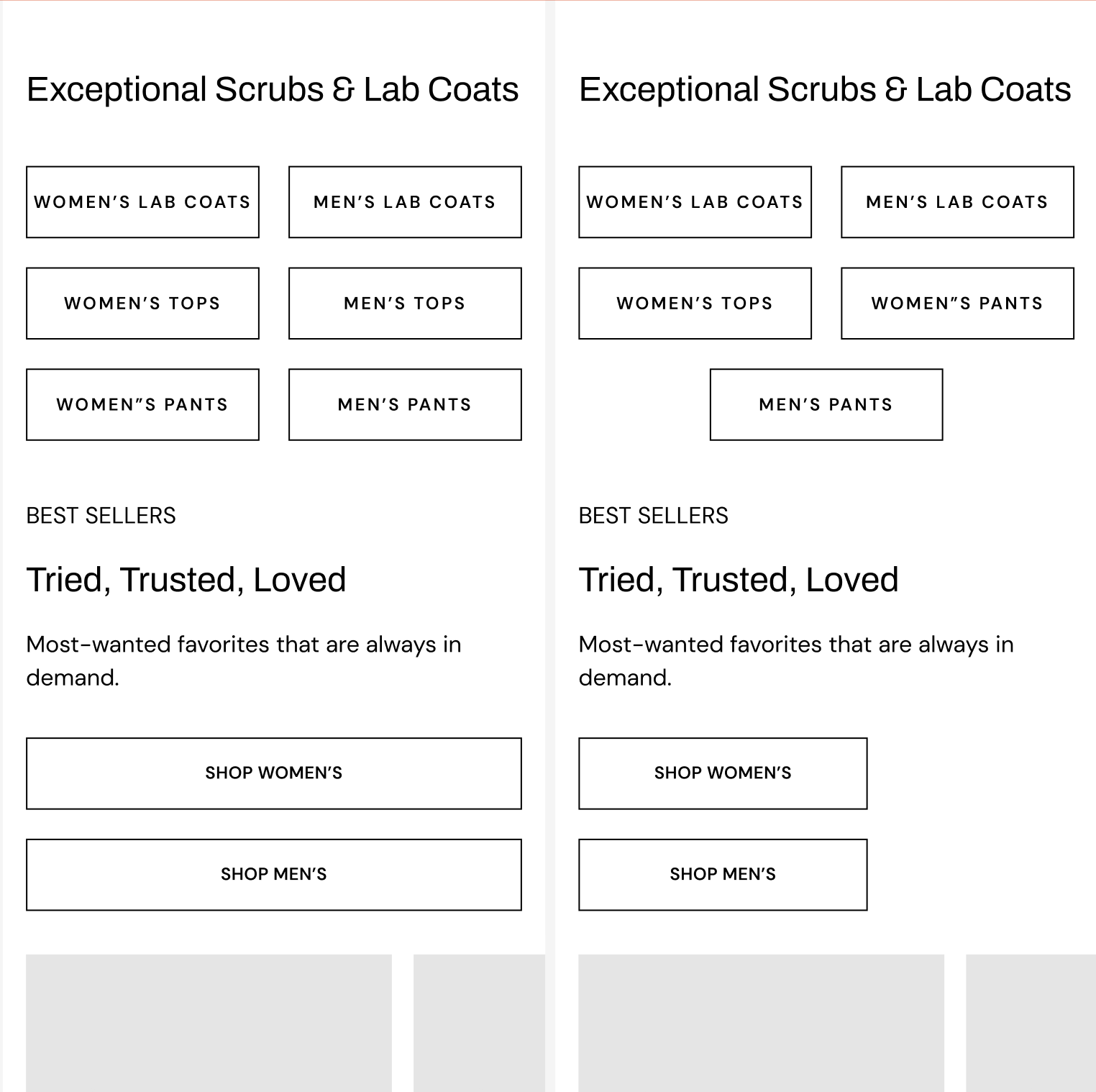
Reusable Components & System Framework
After validating early page models, the focus shifted from individual layouts to building a scalable production workflow. The goal was to reduce fragmentation across brands and replace one-off page design with a consistent method for creating new experiences.
This phase established a shared approach to assembling marketing pages, commerce experiences, and brand storytelling without restarting design decisions for each initiative. By moving from page creation to modular assembly, teams gained greater speed, alignment, and confidence when launching new campaigns or expanding site content.
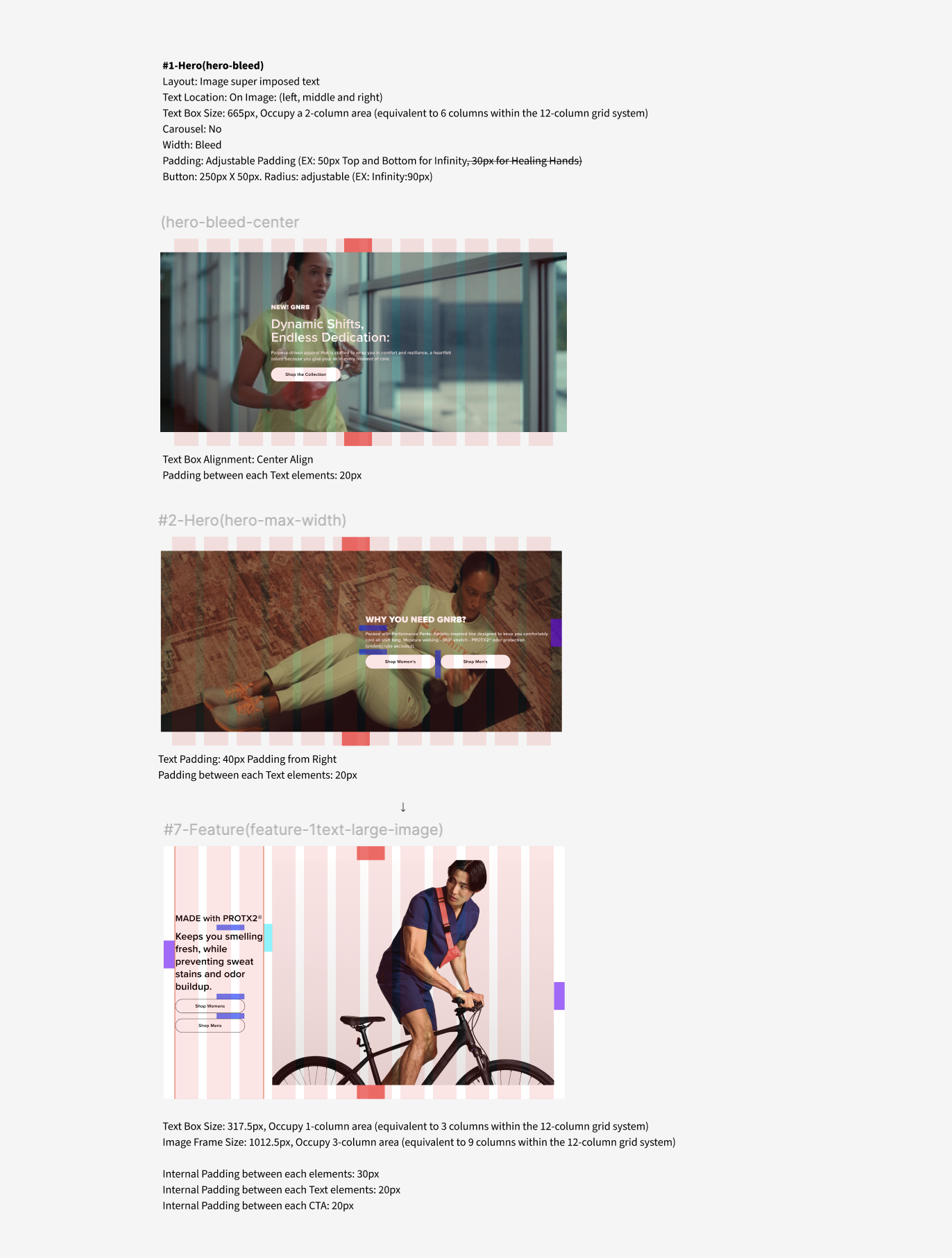
Reusable hero configurations supporting storytelling, campaigns, and brand positioning across multiple sites. Built on a shared 12-column grid, with standardized typography hierarchy (H1–H2–Body), spacing tokens, and brand-specific scaling to maintain consistency while preserving individual brand expression.
Hero Variants
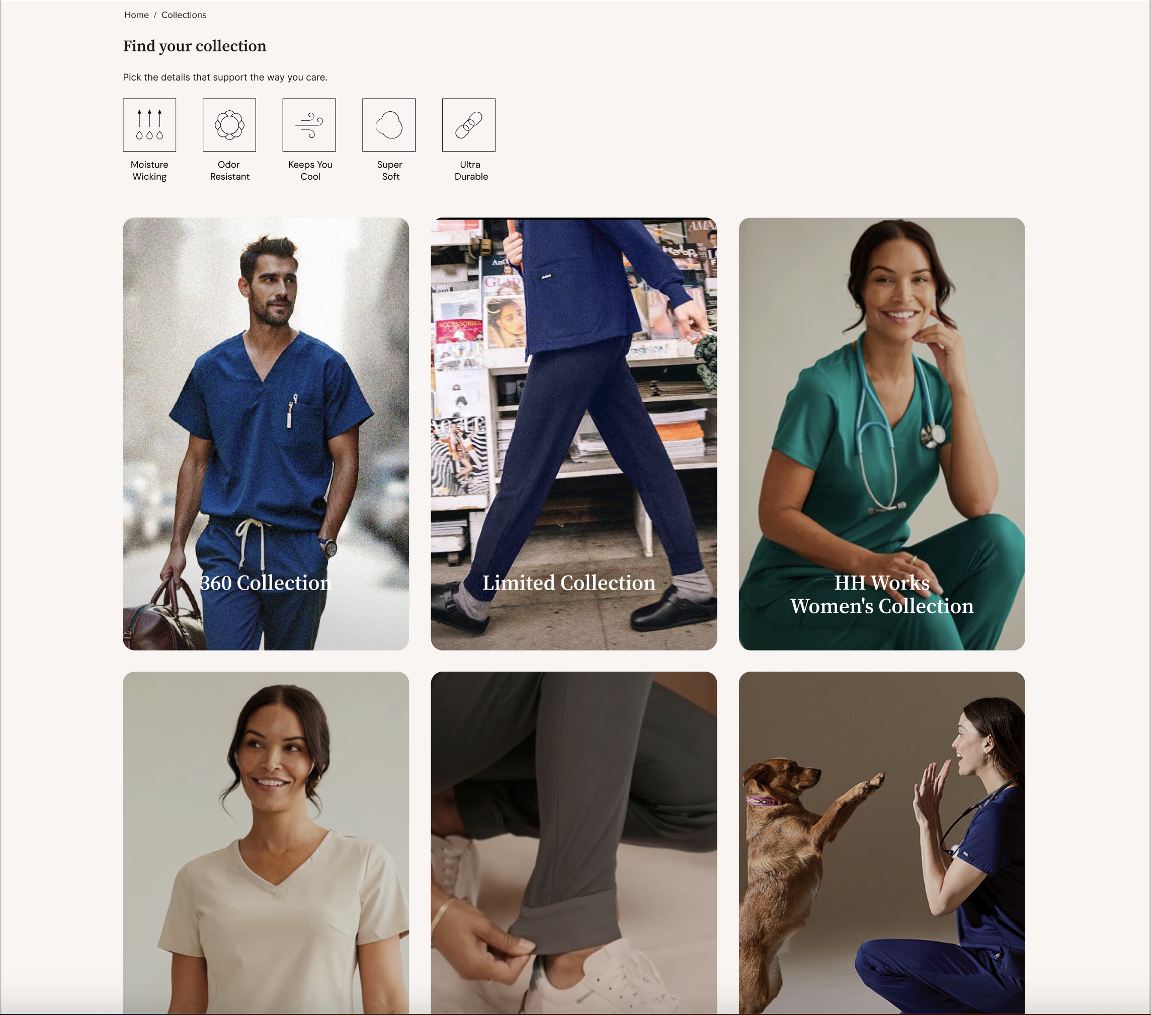
Flexible commerce components supporting product discovery, merchandising, and conversion. Standardized layout, spacing, and hierarchy enable cross-brand reuse while preserving each brand’s visual identity.
Shoppable Modules
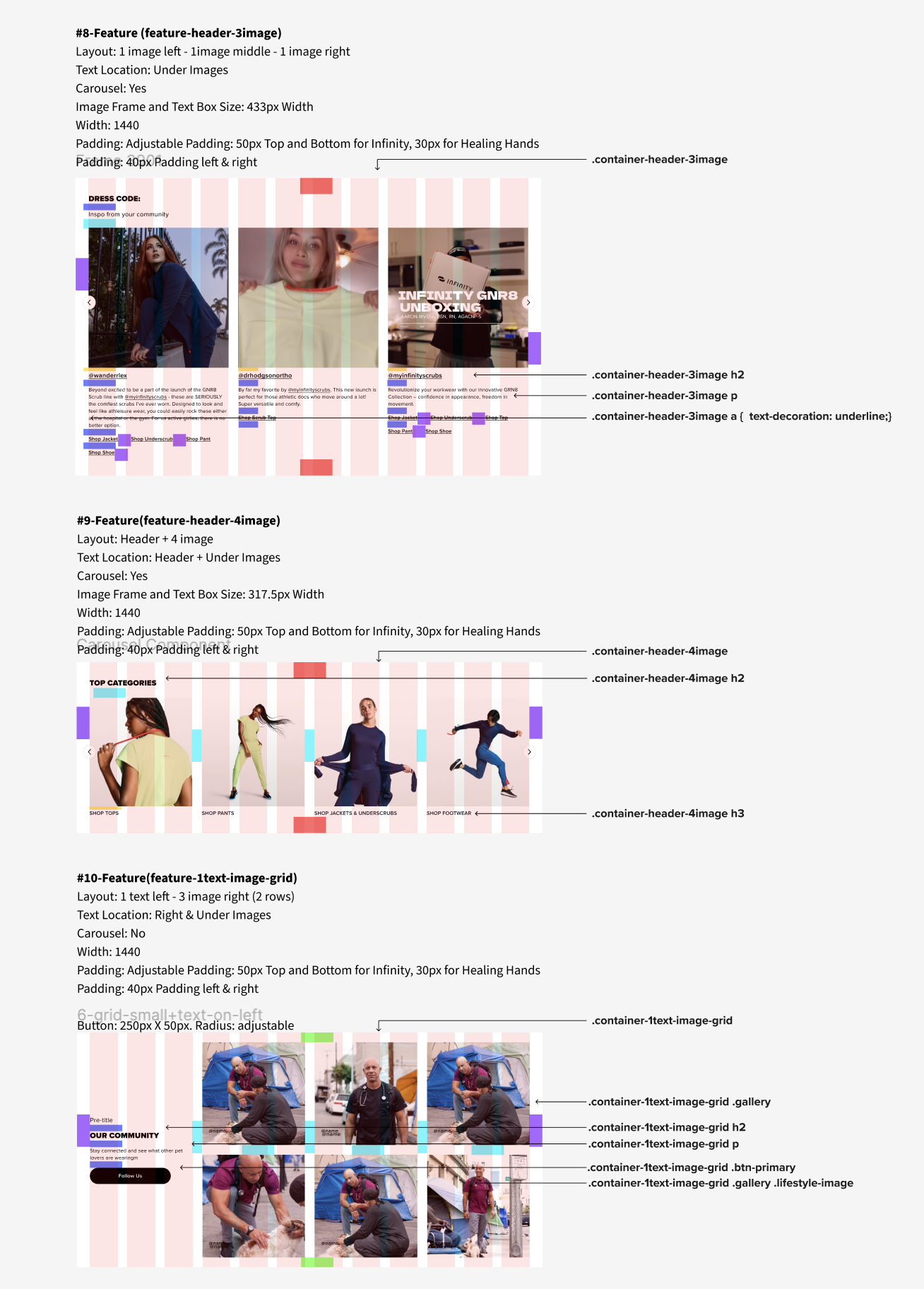
Modular storytelling components adaptable for homepage, landing, and editorial experiences. Defined semantic content structure, layout logic, and reusable spacing behaviors accelerated development and ensured predictable implementation across all Careismatic platforms.
Feature & Content Modules
-
![]()
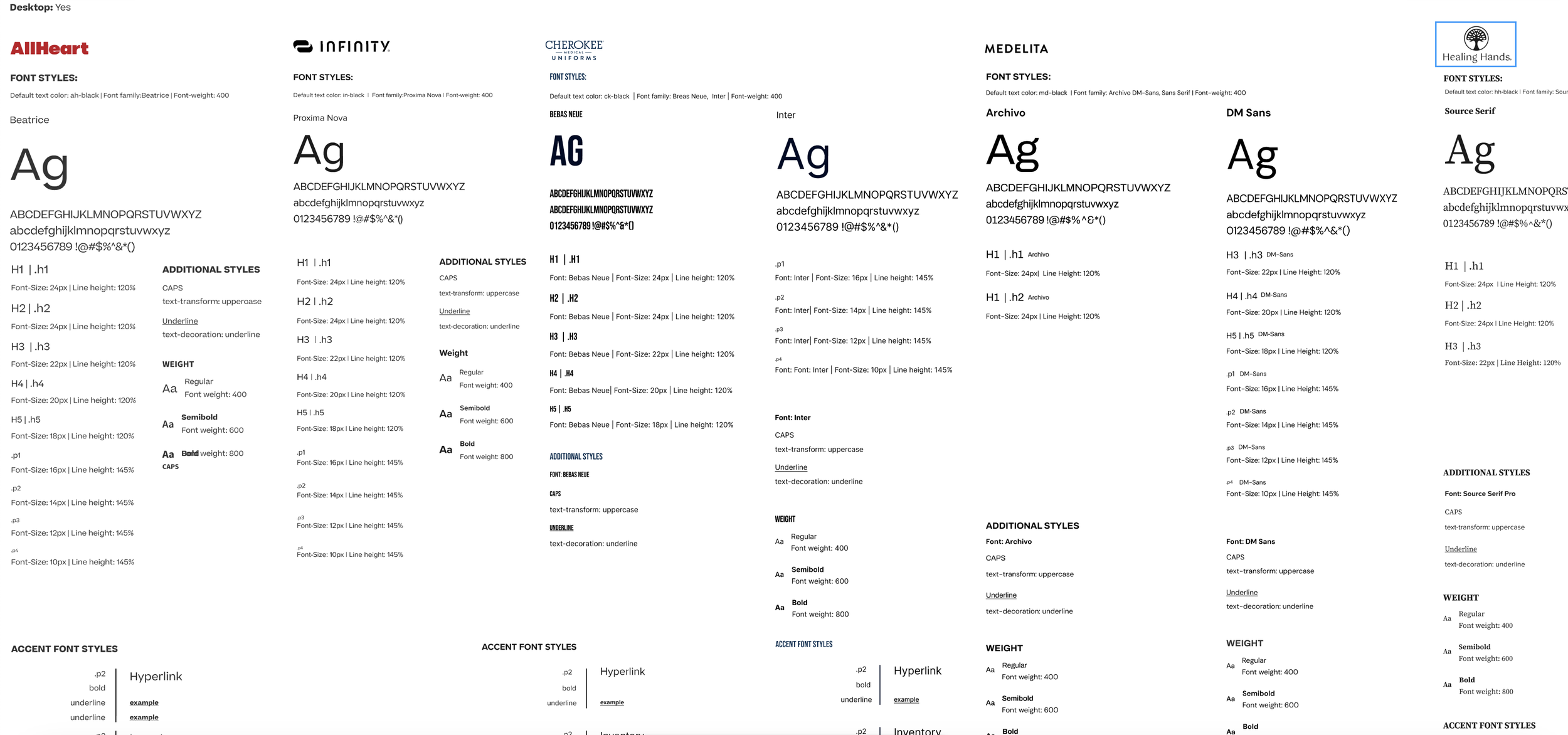
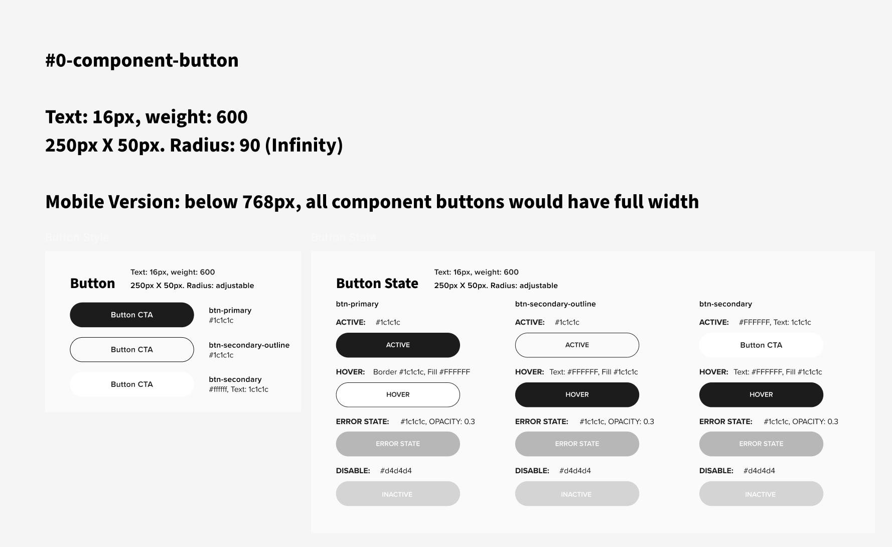
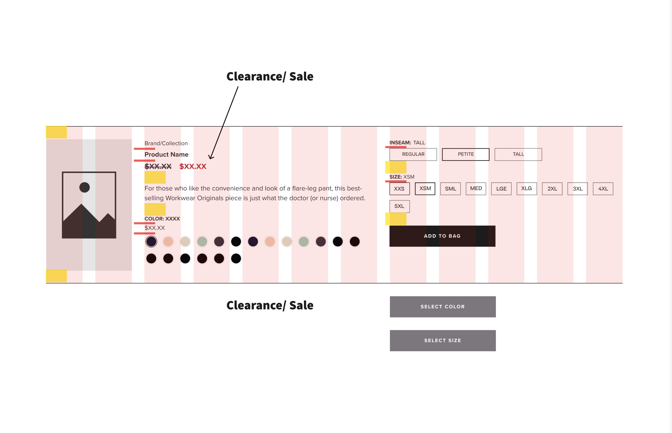
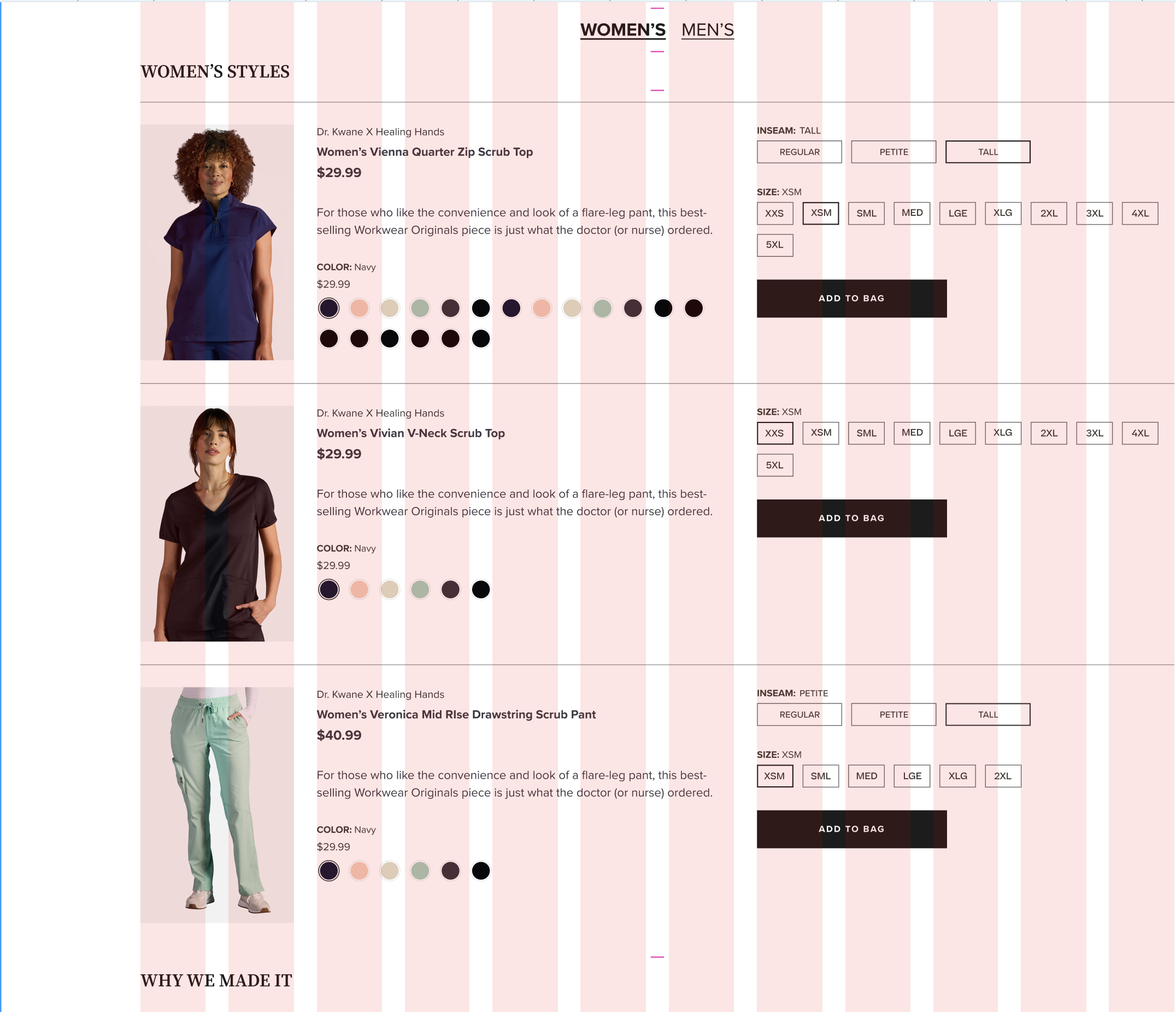
Component Standards & Brand Adaptation
Reusable component standards defining button states, layout configurations, and interaction patterns across brands — enabling consistent behavior while allowing each brand’s color, typography, and visual identity to adapt within a shared system.
-
![]()
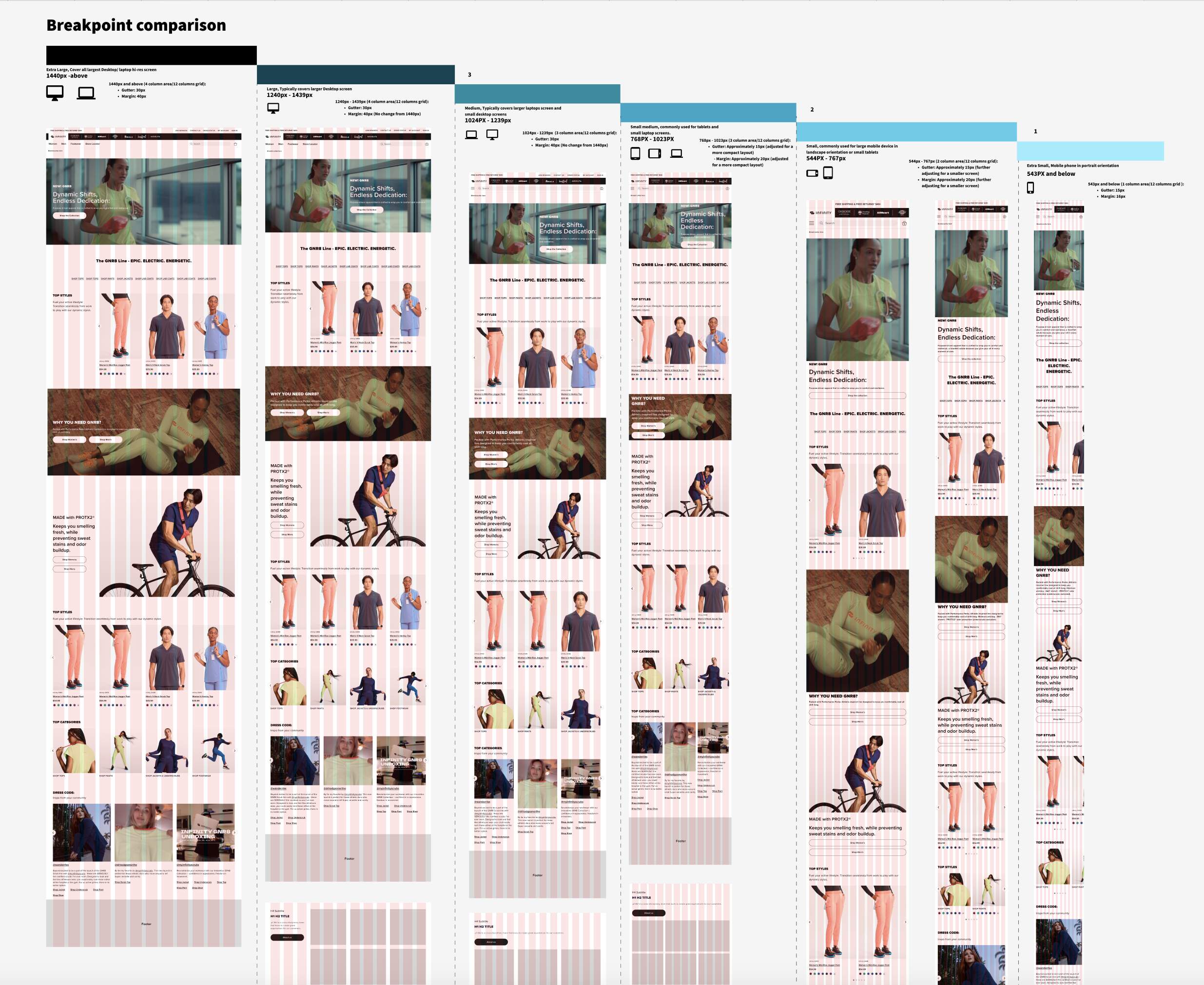
Responsive Grid & Breakpoint Strategy
Responsive behavior validated across desktop, tablet, and mobile breakpoints using a unified 12-column grid system, ensuring layout continuity, scalable content flow, and predictable implementation across all Careismatic sites. -
![]()
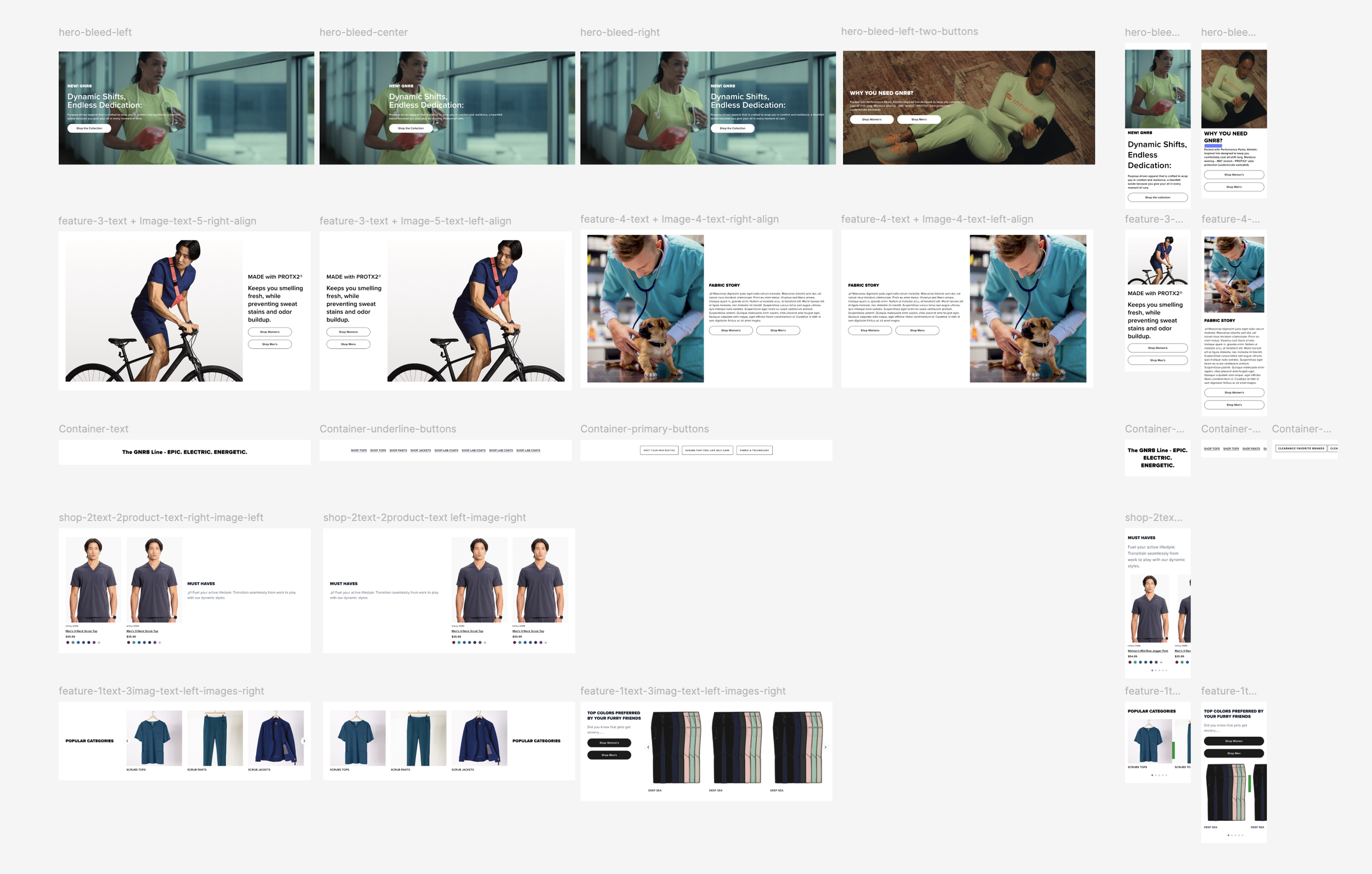
Modular Component Configurations
Systematic component variations supporting multiple content scenarios — including text-image compositions, column structures, feature layouts, and campaign modules — enabling teams to build new pages without reinventing layout decisions.
From System Foundation to Continuous Product Evolution
After establishing the reusable component system, the team continued expanding the ecosystem by building new product experiences directly on top of shared design rules rather than creating one-off solutions.
The system enabled rapid development of new modules — including horizontal shopping components, stacked interaction patterns, and a re-imagined PDP experience — all designed to improve product discovery, reduce friction, and support cross-product purchasing behavior.
By relying on standardized layout logic, responsive behavior, and shared interaction patterns, new components could be introduced quickly while remaining fully consistent across multiple brands and devices.
This phase demonstrated how a strong design system evolves beyond governance — becoming a scalable engine for ongoing UX innovation and commerce growth.
Horizontal Shopping Component Built using established component rules, this layout enables quick-shop purchasing directly within landing pages and PDP experiences, allowing users to shop coordinated products without modal interruptions. A responsive mobile version was developed to maintain consistent behavior across devices.
System in Action — Live Experience Real-world implementation showing the horizontal shopping module supporting streamlined product selection and bundled purchasing behavior. Click Image above to view live example
System-Driven Component Expansion With foundational rules established, new components were rapidly developed — including stackable CTAs, PDP restructuring, and modular commerce layouts — proving the system enabled ongoing evolution rather than a one-time redesign.
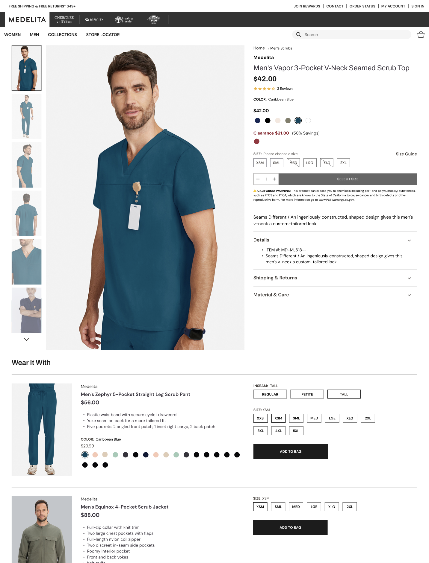
Product Detail Page Evolution Applied system principles to redesign the PDP experience, aligning product media, selection controls, and purchase interactions into a unified structure that improves clarity, scalability, and cross-brand consistency.
Experience the System in Production
The multi-brand design system continues to power Careismatic’s digital ecosystem across multiple brands and product experiences.
Explore live implementations demonstrating how shared UX foundations support scalable commerce, brand expression, and ongoing product evolution.
Brands Powered by the SystemImpact & Evaluation
Following launch, the multi-brand system evolved through ongoing evaluation and real user observation. Using FullStory session analysis, we reviewed how customers interacted with new component patterns, navigation structures, and product discovery flows across brands.
Rather than focusing solely on numerical performance metrics, evaluation centered on behavioral clarity, interaction consistency, and shopping flow efficiency. Session reviews showed users navigating standardized layouts more predictably, interacting confidently with shared UI patterns, and moving between product experiences with fewer interruptions.
The design system aligned design and development teams through a shared framework for building features and campaigns, shifting digital work from isolated page redesigns toward a scalable model of continuous product improvement — establishing a system that enables growth at scale.
This foundation enabled Careismatic’s shift toward direct-to-consumer growth by supporting scalable, consistent digital experiences across brands.